Enable Javascript to browse this site, please.
Workshop led by Refik Anadol and .dotdoclab.
.dotdoclab, 3d, installation
RSS feed for comments on this post. / TrackBack URI
Name (required)
Mail (will not be published) (required)
Website
Δ
photography
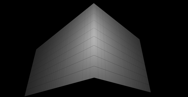
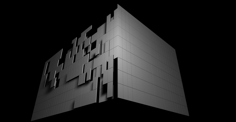
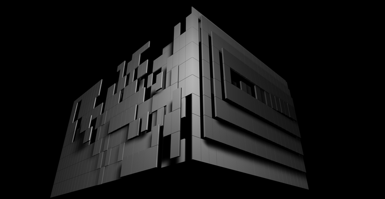
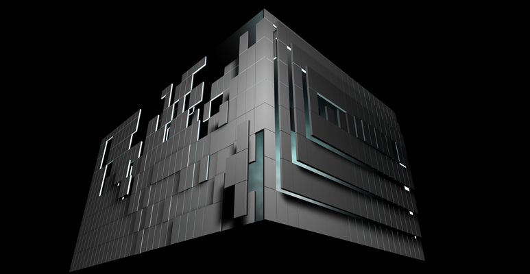
I was fortunate to work with Refik Anadol, Sebastain Neitch, Johannes Schmidt, Kerim Karaoglu and Efe Mert Kaya in creating the opening mapping piece for ARS Electronica's Maintenance, Repair and Operations' Frozen Music in Linz, Austria.
animation, ars electronica, installation
IMAL, Brussels hosted The Artvertiser, a workshop led by Damian Stewart and Julian Oliver. The aim of the The Artvertiser, is to replace street ads with art using their custom Billboard Intercept Units. I used Processing to create my project, Pixiliate, a composition of pixels whose colors are derived from the ad. Unfortunately, I was unable to see the result of the process due to a few demonstrations and heightened police activity.
Animations soon to follow…
imal, processing
animation, processing
The following paper focuses on Glitch as a platform for technological creativity. It is part of a research outcome, which includes a documentary, Glitch — Everything and Nothing, co-produced with Simon Emberton.
documentary arts, writing
processing
The Santralistanbul Energy Museum is filled with so much character. Hidden amongst the pulleys, turbines, generators and fuses are an abundance of human expression. The following images are a selection of pareidolia examples taken from the museum and around Taksim.
.dotdoclab, photography
art direction, graphic design, identity, strategy, user-centered design, web design





RSS feed for comments on this post. / TrackBack URI